
Reader’s Coffee
Books and coffee, designed as one warm ritual.
Brand Strategy, Visual Identity, Packaging, Brand Applications, Art Direction
One character. One cup. One book. A brand system built to feel familiar before a word is read.
Context
Reader’s Coffee was developed as a self-initiated concept around a simple cultural overlap: the quiet pleasure of reading and the everyday ritual of coffee. The opportunity was to make that relationship instantly recognizable without falling into generic café or bookstore conventions.
What needed to change?
The brand needed one visual idea strong enough to work as an icon, a café mark, a packaging device and a small digital avatar. It also needed a warm color system that could feel premium without becoming formal or distant.

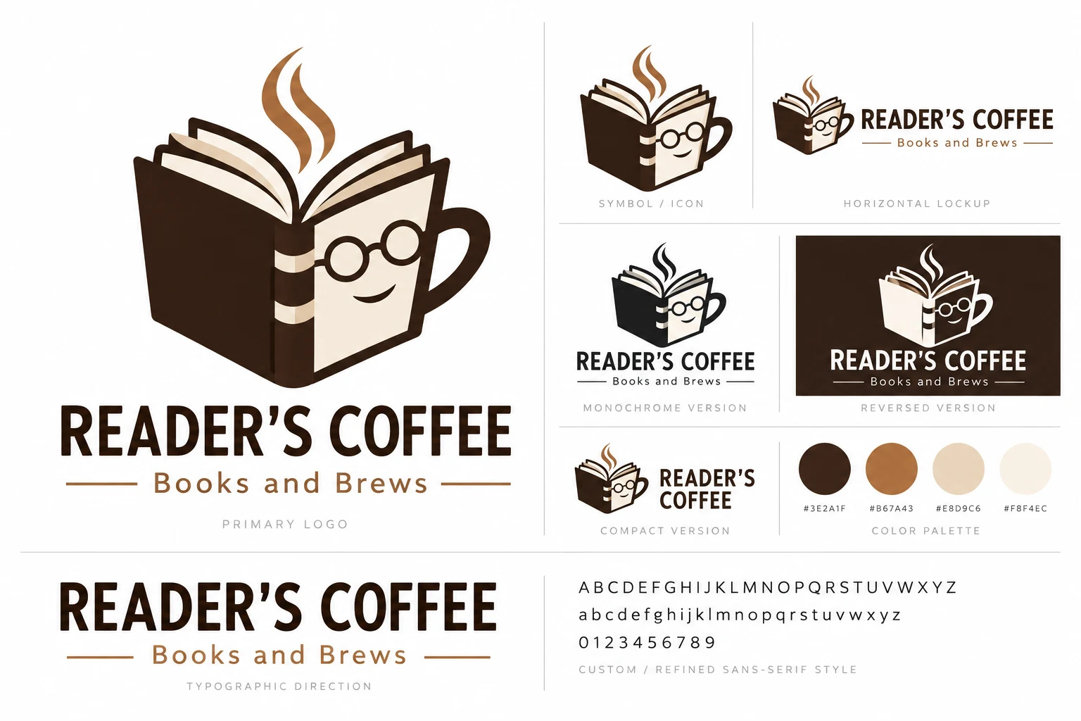
We merged the silhouette of an open book with the language of a coffee cup, then refined the character with glasses and steam. From there, the system was built around espresso brown, caramel and cream, supported by tactile paper, ceramic and natural materials.
The result is a compact identity with personality: friendly enough for everyday use, structured enough for menus and packaging, and distinctive enough to hold its shape across digital and physical applications.

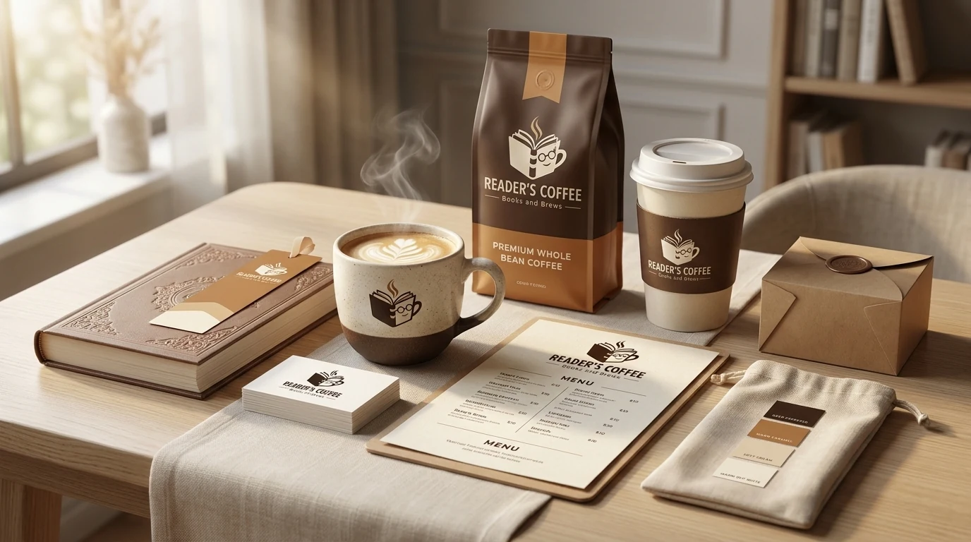
The concept was extended across coffee cups, bean packaging, menus, bookmarks, business cards, notebooks and small hospitality touchpoints. The same visual language remains recognizable whether the symbol appears alone or as part of the full wordmark.
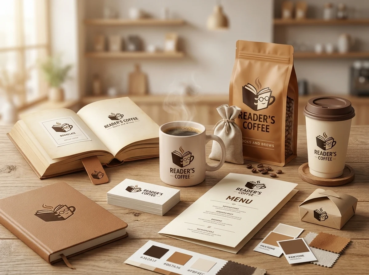
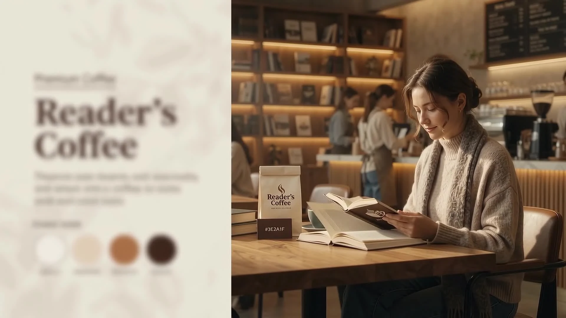
The case study is presented as a cinematic brand world rather than a set of isolated mockups. Warm daylight, books, textured paper, ceramics and café scenes create one consistent atmosphere around the identity.
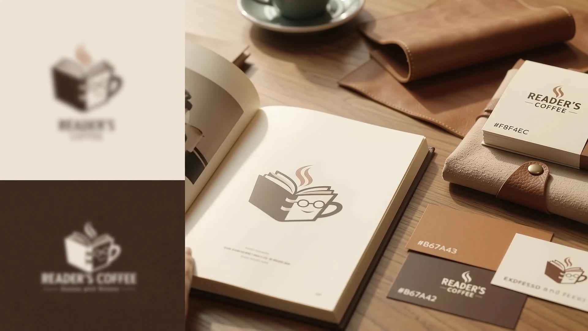
Self-initiated concept deliverables: primary logo, symbol, horizontal and compact lockups, monochrome and reversed versions, color palette, typography direction, packaging concepts and café brand applications.