
Petit Jardin Milano
Communicating more by showing less.
Two readings. One message.
THE CHALLENGE
Petit Jardin Milano needed to communicate a sensitive beauty-product message in a context where direct depiction of the female body was not an appropriate communication route. The challenge was not simply to remove explicit imagery, but to preserve the meaning of the communication while expressing it in a more restrained visual language.
THE COMMUNICATION PROBLEM
A conventional advertising route could rely on direct body imagery to communicate the intended effect. Here, the task was to keep the product message present without showing the subject literally — creating a solution that was culturally aware, visually distinctive and practical enough to work in a real exhibition environment.
Straight lines become controlled waves.

Communicate the idea without showing it literally.
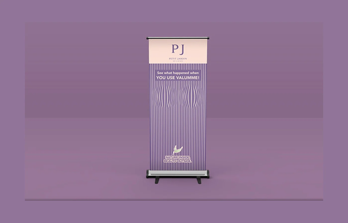
We developed an abstract visual system based on vertical lines and controlled waves. At first glance, the pattern reads as an elegant decorative graphic. Through the movement and curvature of the lines, it also creates a secondary suggestion connected to the product's purpose — without explicitly depicting the female body.
The visual language was built around controlled distortion. Straight vertical lines gradually shift into curves, creating a sense of volume and form through rhythm and composition rather than literal representation. The viewer discovers the message instead of being shown it directly.
The abstract idea became a physical advertising asset.
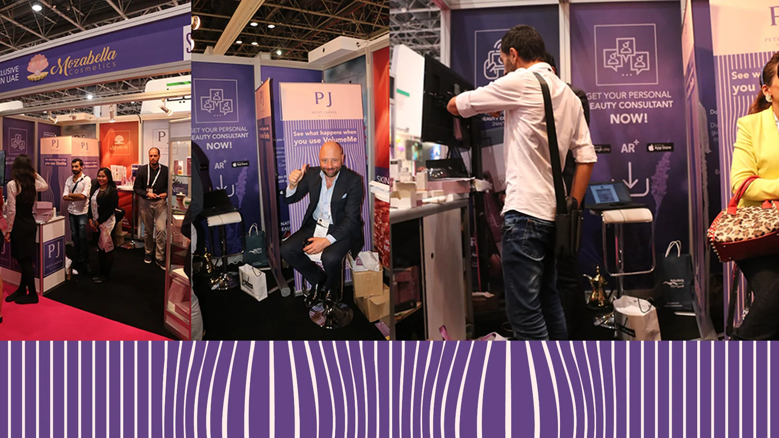
The concept was translated into a large-format roll-up for Petit Jardin Milano's trade-show presence. The system maintained a clear hierarchy between the brand identity, product message, abstract visual language and supporting communication while giving the piece a recognizable presence without relying on conventional product imagery.
Designed for the trade-show floor.
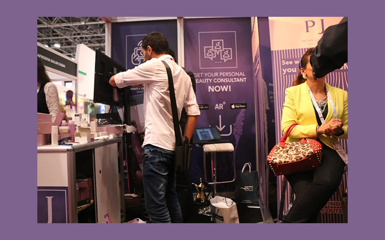
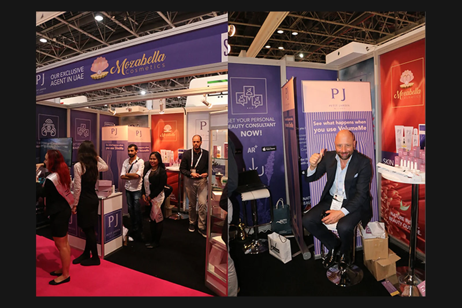
The final roll-up was used in Petit Jardin Milano's Beautyworld trade-show environment, where the visual could operate simultaneously as brand communication and as a point of visual attention within the exhibition space. The concept was well received by the client's Italian marketing team.
Think → Create → Execute
This project demonstrates creative problem solving, cultural sensitivity, visual communication through pattern and distortion, and the translation of an idea into a real physical advertising asset. No quantified campaign-performance claim is made because verified performance metrics were not supplied.