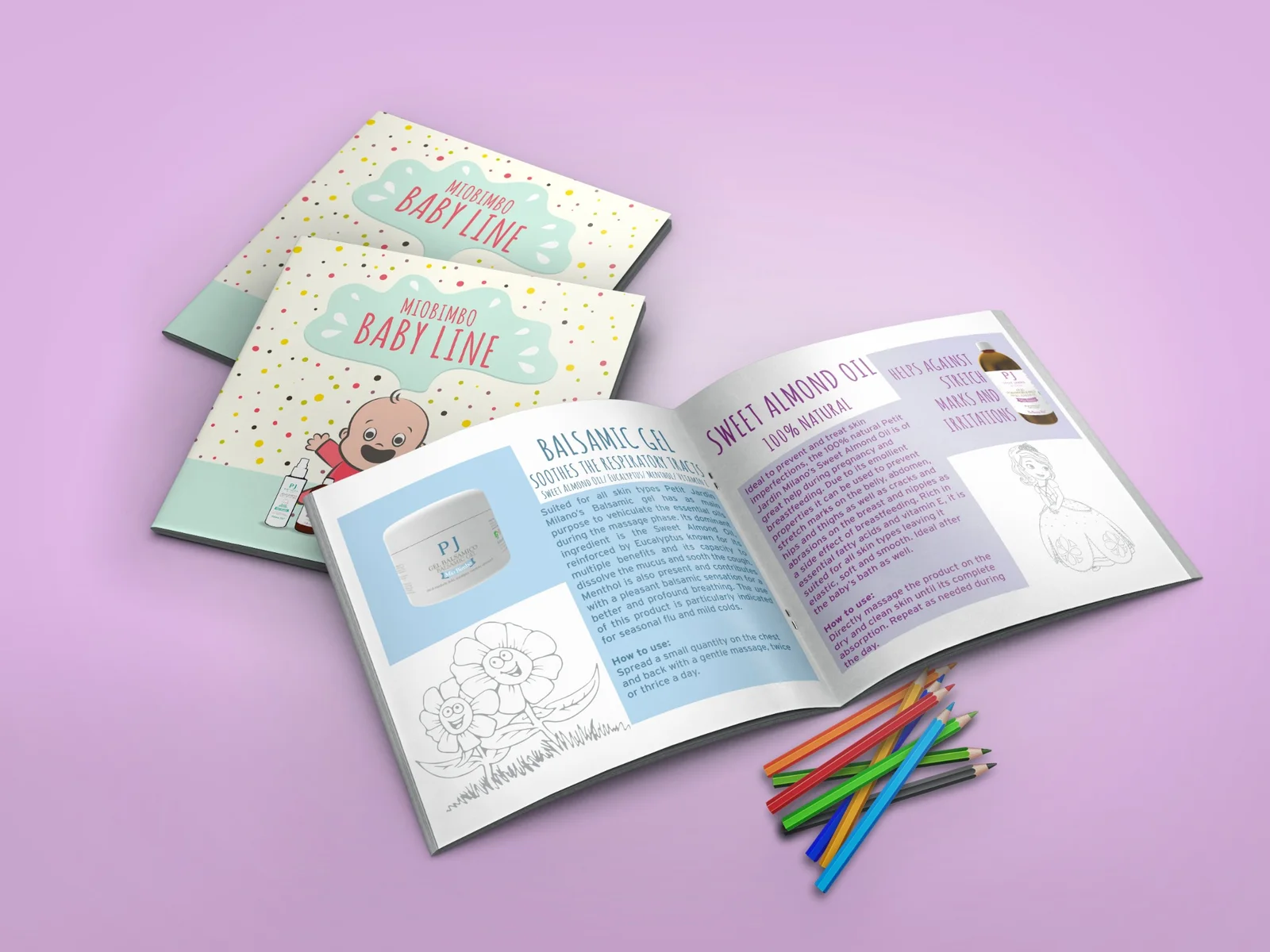

MioBimbo Baby Line
A brochure designed to be played with, not simply read.
From brochure to coloring book.
THE CHALLENGE
MioBimbo needed more than a conventional baby-care product brochure. The communication had to remain useful to the parent making the purchase decision while giving the child a genuine reason to notice, open and interact with the printed piece.
THE INSIGHT
The brochure did not have to behave like an advertisement. Instead of treating print as a passive carrier of information, we treated it as an experience: product information for the parent, illustration and coloring for the child, all inside the same physical object.
Product information + activity + physical interaction.
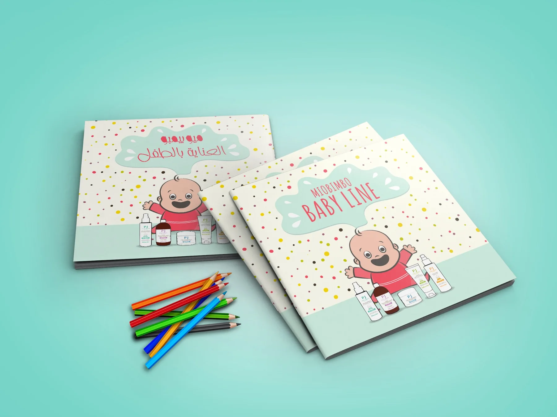
Playful on the surface. Structured underneath.
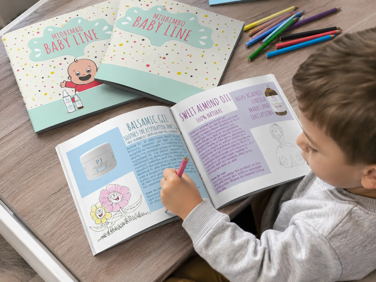
The publication combined a soft pastel palette, expressive display typography, simple illustrations and dedicated coloring areas with a clear editorial structure. Product information remained organized and easy to navigate while the playful layer gave the child a reason to participate.
The final brochure was distributed with colored pencils. Rather than adding an activity as an afterthought, coloring became part of the brochure's identity and function. One side of the experience communicates products and practical information; the other invites participation and play.
Useful to the parent. Engaging for the child.
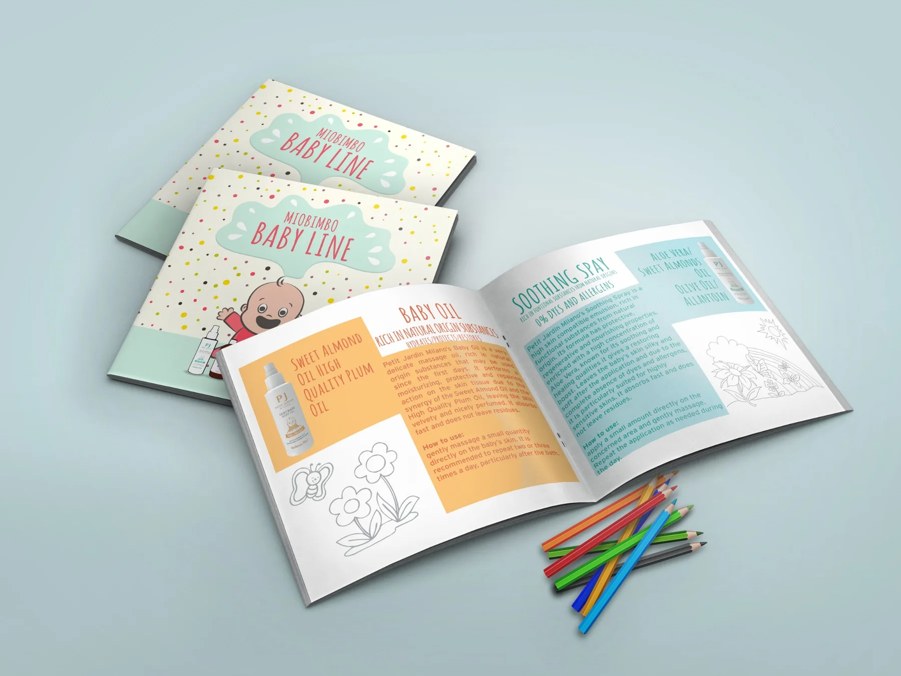
For the parent, the brochure presents product information, usage guidance and a clear editorial hierarchy. For the child, it provides illustrated characters, coloring activities and a physical reason to spend time with the piece. The same object supports both forms of attention without separating the experience.
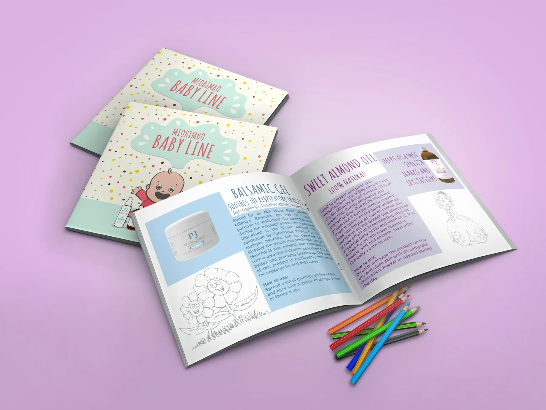
Don't only tell the audience about the product. Give them something to do.
The brochure became something to open, explore, color and keep. By changing the role of the printed format itself, a standard promotional brochure became a small interactive brand experience built around participation rather than passive reading.
Rethink the format, change the interaction.
The project transformed a conventional product brochure into an interactive promotional object combining product communication, illustration, coloring and physical engagement. No quantitative campaign or sales result is stated because verified performance data from the 2017 project was not supplied.