
KUVA — Mobile Brand Identity
A directional identity built to feel fast, compact and recognizable across the product.
One compact mark, designed to survive every scale from the back of a handset to a full product presentation.
THE PROJECT ARCHIVE
The supplied KUVA archive documents a mobile-brand identity exploration across logo development, device branding, packaging, product visualization and digital presentation. This case study combines those original project files with newer presentation media so the archive remains visible rather than being replaced by recreated imagery.
THE DESIGN PROBLEM
A mobile identity has to work under very different conditions: a small mark beside a camera module, a full wordmark on packaging, a dark launch visual, a light device finish and a compact screen application. The system therefore had to remain clear without depending on one background, one color or one scale.
The mark, the palette and the product were designed to read as one system.
Negative space, direction and movement.
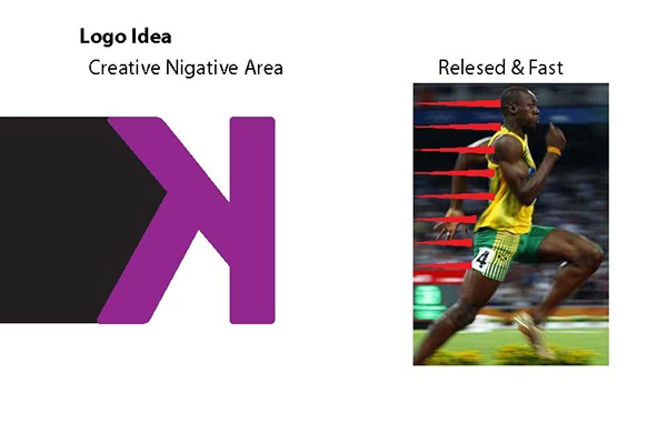
The original logo-development material shows a K-based idea built through negative space. Directional line work and the visual reference to speed reinforce a sense of forward motion, while the simple silhouette gives the symbol enough strength to remain visible at small product scale.
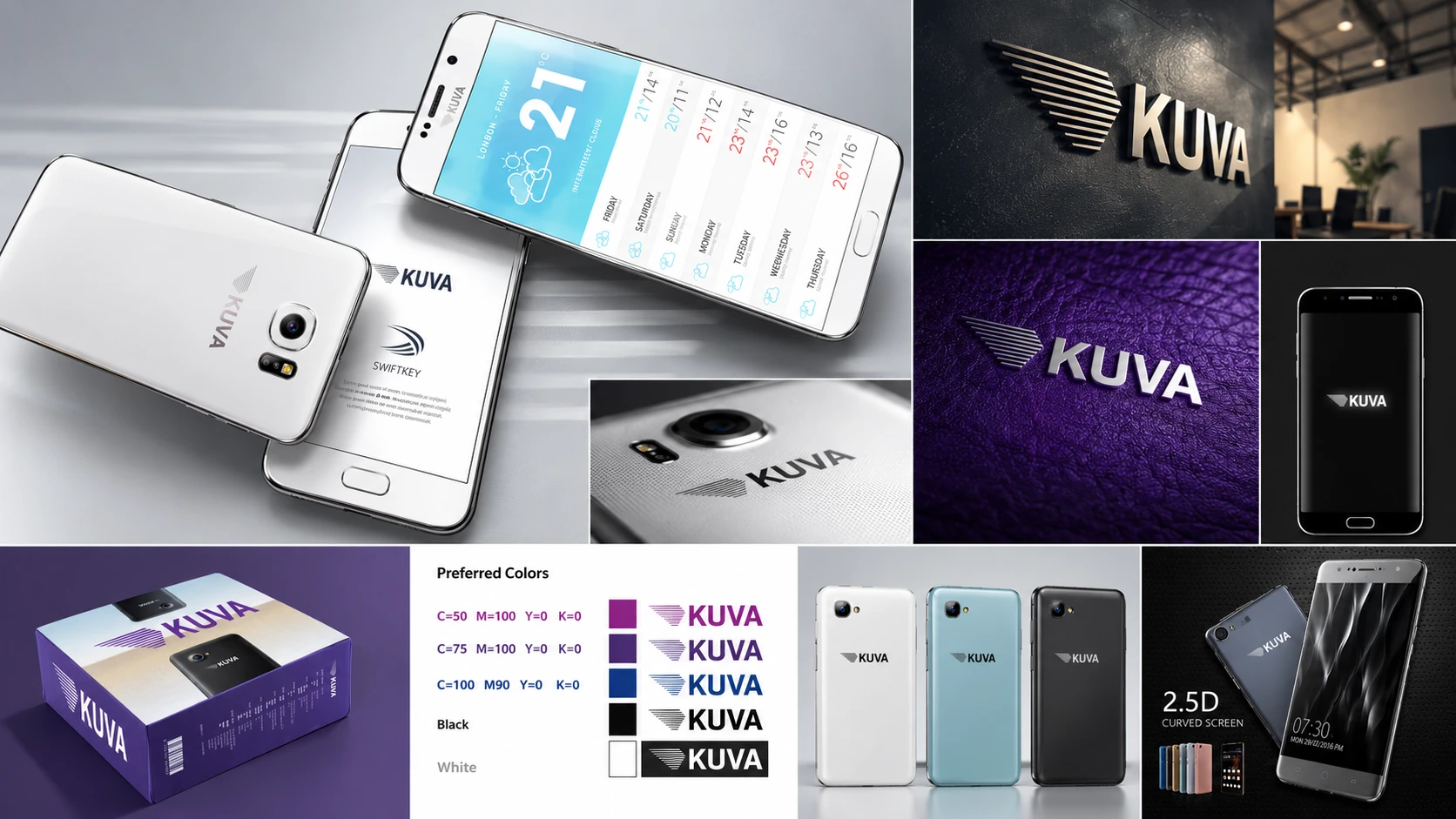
The identity was extended as a flexible product-branding language rather than a single logo placement. The archive shows monochrome and colored mark variants, applications across white and dark device finishes, packaging, product renders and interface-style communication. Purple, violet, blue, black and white create a technology-oriented range while allowing the mark to adapt to different materials and backgrounds.
Packaging, product visuals and device applications from the supplied original files.
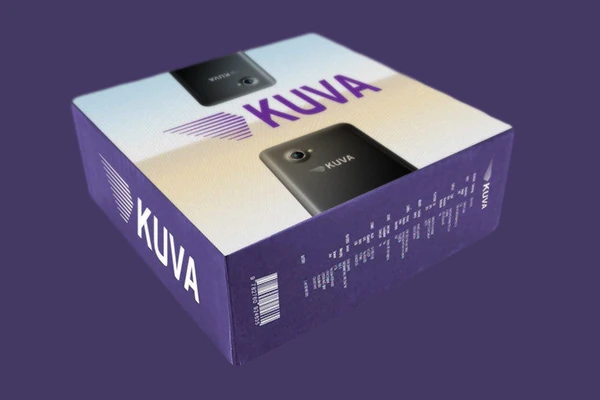
The original archive is intentionally kept inside the case study. It shows the KUVA identity on packaging, curved-screen product communication, handset backs and logo implementation tests. These materials preserve the actual design-development record and give context to the newer cinematic presentation.
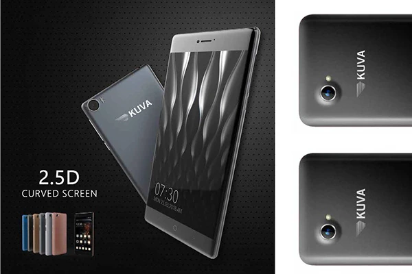
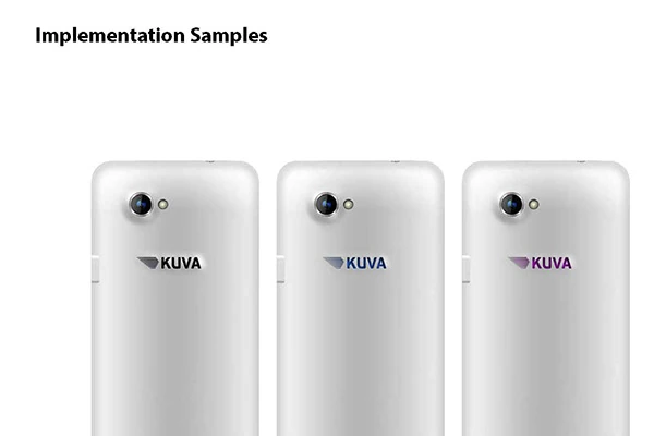
A mark tested directly on the product surface.
The project archive includes implementation comparisons showing how the symbol and KUVA wordmark behave on light device finishes and in different color treatments. The materials are presented here as identity-design and product-visualization work. No claim is made that the pictured devices, packaging or interface concepts were manufactured, commercially launched or produced by Brandeta unless separately verified.
A visual identity developed across the product ecosystem.
The supplied archive documents a coherent design direction across logo development, color variants, handset branding, packaging and product-presentation visuals. No sales, launch, manufacturing or campaign-performance result is claimed because verified outcome data was not supplied.